

Berkshire Women's Aid: Website Redesign Case Study
BWA supports anyone experiencing domestic abuse across Berkshire, from emergency refuge accommodation to outreach services and children's programmes. Their existing site had a broken hero image, outdated homepage content, and no clear path to help. We rebuilt it to function as a proper lifeline.
A broken site for people who needed it most
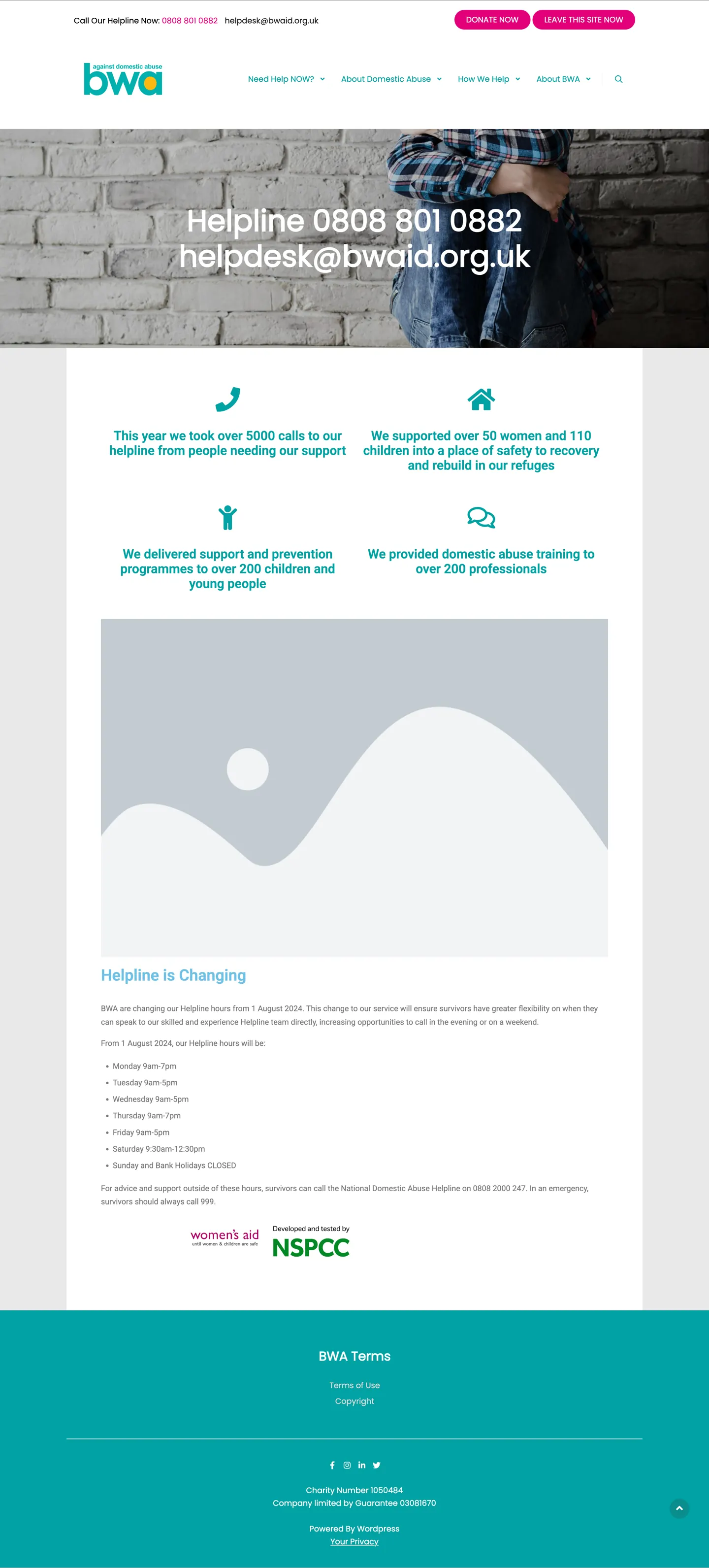
BWA's old website was built on a dated template with a large hero image that had stopped loading. The most prominent element on the homepage was a grey broken-image placeholder. That was the first thing someone in crisis saw when they searched for help.
Below that, outdated content from 2024 about helpline hour changes sat in the middle of the page. The impact stats were there, and impressive. 5,000 helpline calls, 50 women and 110 children housed in refuge, training for over 200 professionals. But they sat in small teal icons on a grey background. Easy to miss, and disconnected from the weight of that work.
The footer was a solid teal block with sparse links and no clear structure. On mobile, nothing was optimised for the conditions under which many visitors would actually be using the site: quickly, privately, often in distress.
BWA had the credibility: endorsed by Women's Aid and developed in partnership with the NSPCC. None of that came through on the homepage.
Scroll through both sites below
Built for the moment someone first reaches out
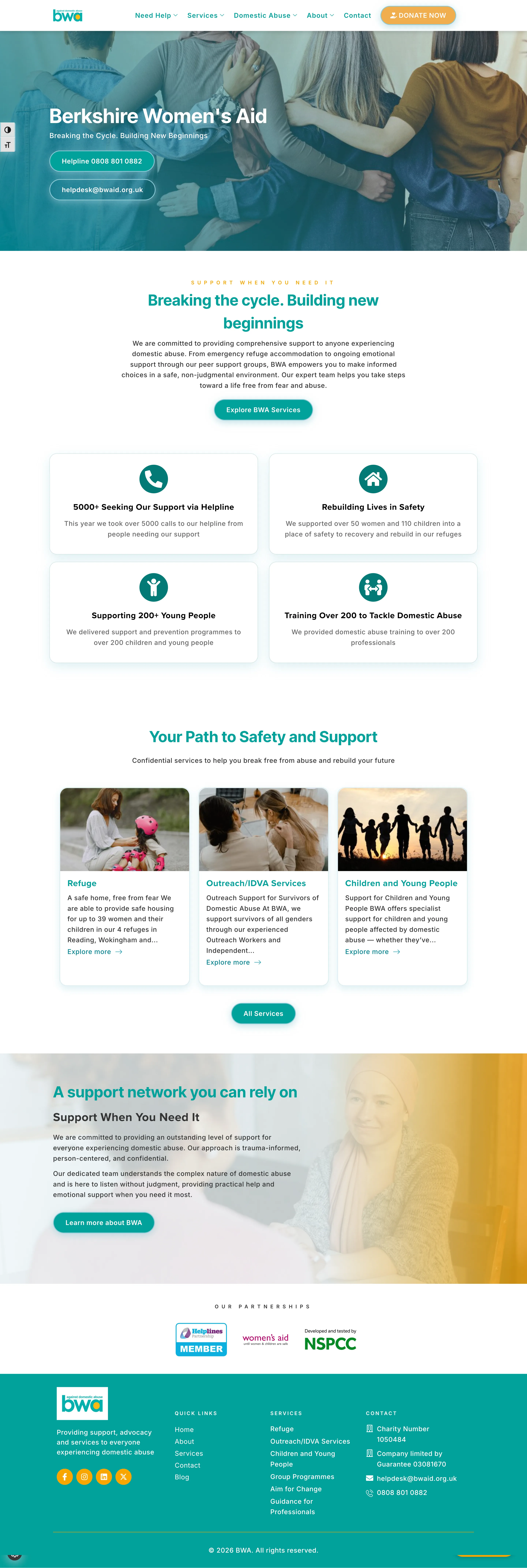
Helpline number front and centre
0808 801 0882 is visible immediately on every page, on every device. No scrolling, no searching, no barriers.
No broken images
The homepage hero was rebuilt with proper imagery. The broken placeholder that greeted every visitor was the first thing to go.
Impact stats given proper weight
5,000 helpline calls and 110 children supported are now headline numbers, not small teal icons on a grey background.
Quick exit retained and improved
The "Leave this site now" button stayed, as an essential safety feature. We made it more accessible and positioned it consistently on every page.
Service directory with clear pathways
Refuge, outreach, children's services, training, and legal advocacy each have dedicated pages with straightforward referral routes.
Donation page that keeps people on site
The donate button now leads to a proper donation page. Clear options, Gift Aid, and no redirects to confusing third-party platforms.
A site that earns the trust BWA's work deserves
Berkshire Women's Aid has been operating for decades. They answer over 5,000 helpline calls a year. They house more than 50 women and 110 children in refuge. And they train hundreds of professionals to recognise and respond to domestic abuse. Their work is serious, evidence-based, and vital.
Their website now reflects that. A survivor visiting at a difficult moment, a funder doing due diligence, a professional referring a client: each finds what they need quickly and clearly.
The helpline number is impossible to miss. The impact data is visible. The service directory is easy to navigate. And the quick exit button is there every time it might be needed.
What people ask about this redesign
For a domestic abuse charity, a visitor may be reading the site with someone standing behind them. Quick Exit replaces the page instantly with something unrelated. It is not a design flourish, it is a safety feature, and it has to work every time, on every page, without fail. We kept BWA's existing Quick Exit button and made it more accessible and consistently positioned rather than treating it as optional.
This was a redesign of an existing site, not a build from nothing, which meant there was more to work with from the start: BWA's content, structure, and domain were already in place, so the work was rebuilding the template and information architecture around what already existed, rather than starting from a blank page.
No. BWA kept their existing domain, and the redesign rebuilt the site in place rather than moving to a new URL structure, so there was nothing to redirect and nothing for search engines to lose track of. For a service people search for in a crisis, staying findable throughout mattered as much as how the new site looked.
Your charity's work deserves a site that shows it properly.
Book a free 20-minute call. We will look at what you have and tell you honestly what a redesign would involve. No commitment, no pressure.